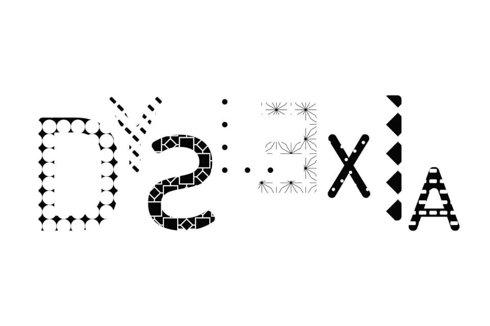
There is growing research to support the fact that we can make reading easier on people with dyslexia by changing some things about how the words are presented, also known as dyslexic fonts. It’s true, different fonts, color backgrounds, or spacing of the letters and words may change the fluency of a reader with dyslexia. This is not a “trick”, but rather a way to level the playing field for your struggling reader.
While you cannot change the fonts, spacing, or colors of printed books to make them more accessible, you can personalize all of the books on LightSail by using their Personalized Reader! Some general recommendations are offered below, but be sure to check in with your child’s teacher, reading specialist, or speech language pathologist about the best way to personalize their reading experience to meet their specific needs.
1. Font
While there are some dyslexia fonts for children, there is not currently consistent research to support that certain fonts make reading easier for people with dyslexia. Some research has found that sans serif, monospaced, and roman fonts improve reading performance.1
LightSail Personalized Reader uses X font,
2. Size
Larger font sizes are helpful for children with dyslexia because they make the letters clearer and improve reading speed.2 The best dyslexia fonts are ones where you can adjust the size. You can change the size of the text on your child’s books by adjusting their personalized reader settings.
3. Spacing
Children with dyslexia can be particularly affected by crowding, where they cannot see each letter clearly.3 More spacing between letters and words can help them recognize letters and therefore, make word identification and phonological decoding easier.4 Thus, large letters and word spacing is recommended to improve reading performance among children with dyslexia.5
Dyslexia fonts that allow you to change the spacing can significantly help children with dyslexia.
4. Colors
Contrast between the color of the background and letters is helpful to all readers, but particularly for children with dyslexia. For example, a simple white background and black text offers contrast.
While research is mixed on whether colored backgrounds improve reading performance in children with dyslexia, trialing colored backgrounds may be useful because they reduce visual strain.6,7 When using a colored background, using warm background colors like peach, orange, and yellow is preferred over cool colors like blue, grey, and green.8 LightSail’s Personalized Reader allows you to easily trial different colored backgrounds.
Adjusting the size, spacing, and colors of the text your child is reading can help them read more easily. Fortunately, LightSail’s Personalized Reader allows you to adjust each of these things! LightSail allows you to easily increase the size and spacing of the text to your child’s preference. The Personalized Reader also has a variety of colors you can choose from for both the background and the text. Personalizing your child’s reading experience so that it meets your needs has never been easier!
Posted on 9.Sep.21 in Struggling Readers